Pita Paradise
Pita Paradise is a responsive restaurant ordering experience designed to make browsing a Mediterranean menu feel simple, fast, and enjoyable.
The goal of this project was to create an end-to-end ordering flow that helps users quickly find what they want, customize their meal, and check out with ease across both desktop and mobile.
-
Conceptual restaurant ordering experience
Responsive design for mobile and desktop
Focused on fast decision-making and customization
Emphasis on real-world order behavior
The Problem
Ordering food online should feel quick and intuitive, but many restaurant websites create friction through cluttered menus and poor mobile experiences.
Key UX Decisions
The following design decisions guided how users move through the experience, from browsing the menu to completing an order.
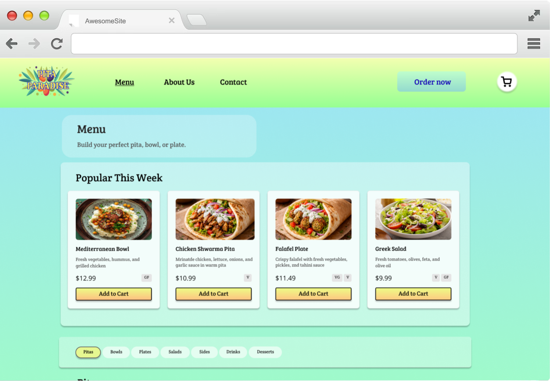
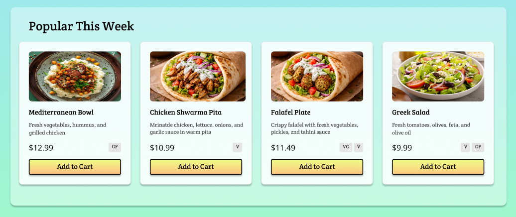
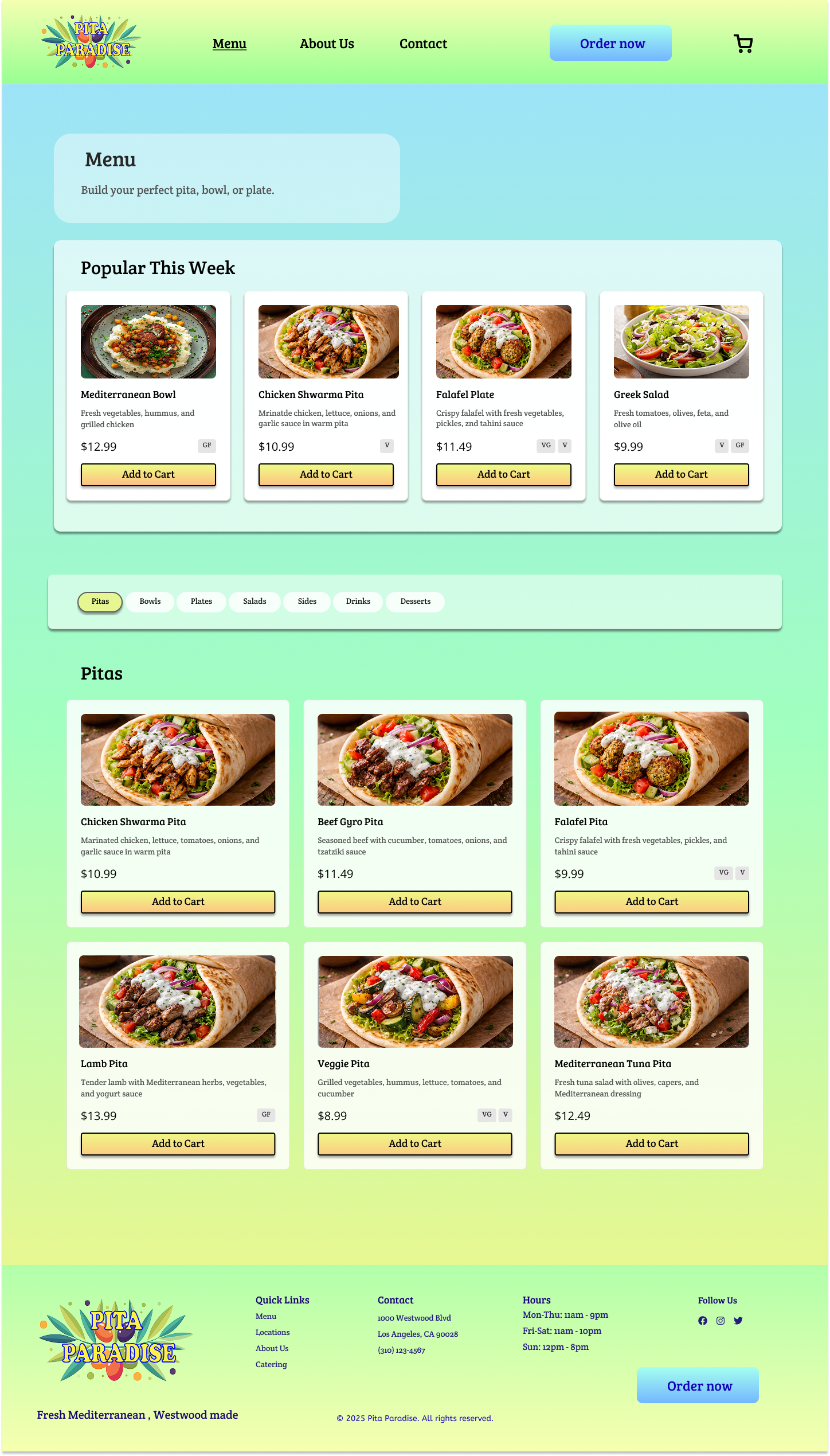
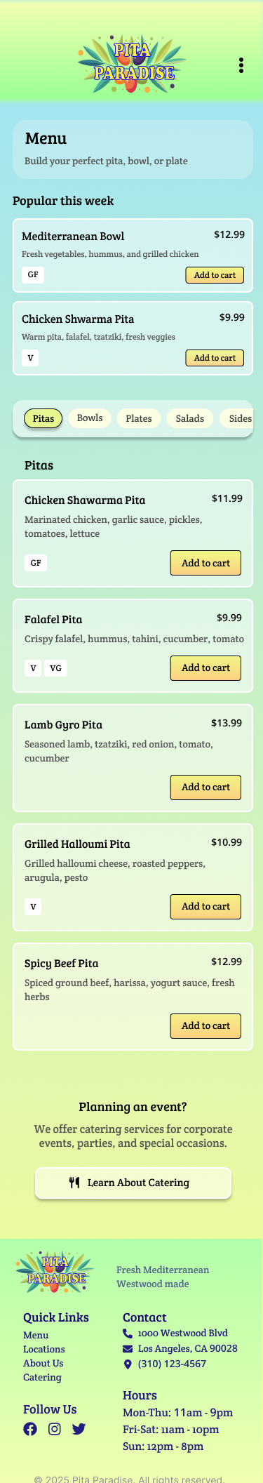
Using popular items as an entry point
To help users get started quickly, I surfaced popular items at the top of the menu as a clear entry point.
This reduces decision fatigue and reflects how people often make choices in real life by opting for familiar or recommended options.
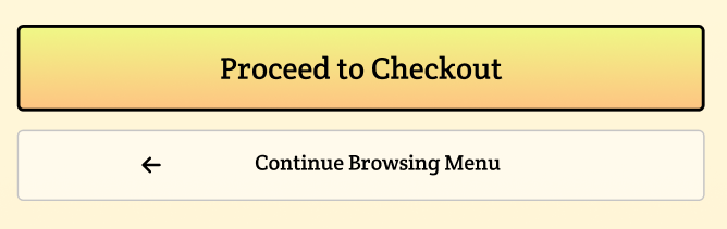
Using visual hierarchy to guide action
Not all actions in the ordering flow carry the same weight, so visual hierarchy was used to guide users toward the next best step. Primary actions like “Order Now” and “Proceed to Checkout” are more prominent, while secondary actions like “Continue to Browsing Menu” are visually quieter.
This helps users understand what to do next at a glance and move through the experience without feeling distracted or overwhelmed.
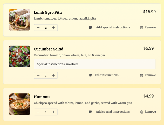
Making the cart easy to edit and review
The cart was designed as a flexible review space rather than a final checkpoint. Users can adjust quantities, remove items, and add special instructions without disrupting the checkout flow.
This helps users feel more confident before placing their order.
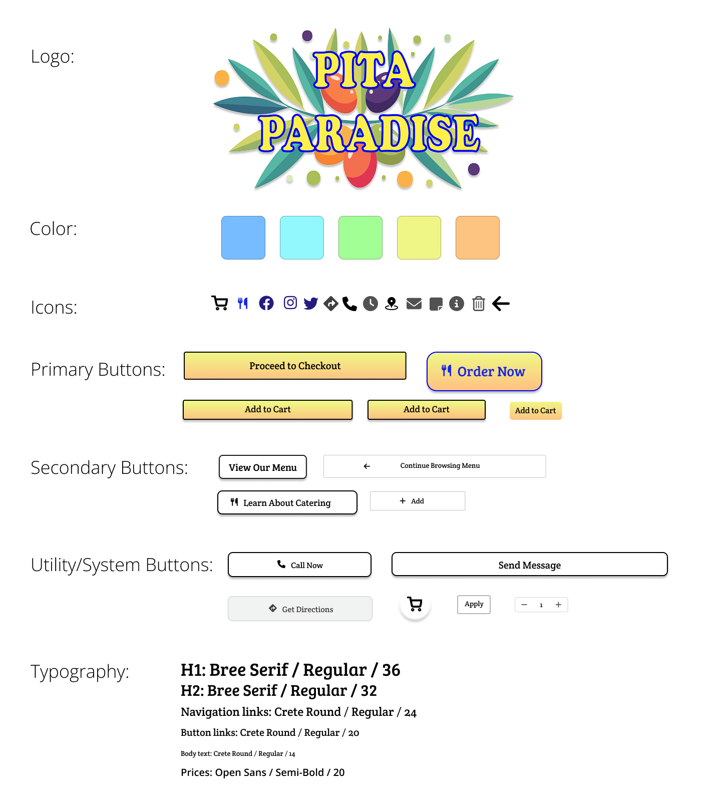
To maintain consistency across screens, I created a small UI system that defined core elements like buttons, color usage, and typography.
This helped keep the experience cohesive while designing both desktop and mobile.
Designing Across Devices
The desktop menu prioritizes comparison and visual scanning, while the mobile experience focuses on vertical flow and quick actions.
Key elements like popular items, category navigation, and add-to-cart actions were adapted to support one-handed use without sacrificing clarity.
Cart & Checkout
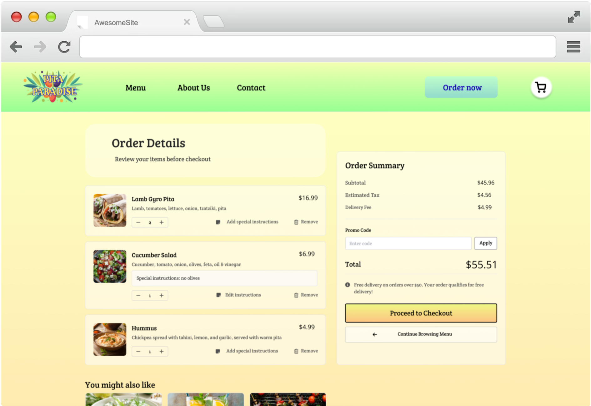
The cart was designed as a clear review space, allowing users to adjust items, review costs, and move forward without breaking their flow.
Quantity controls, special instructions, and item removal are available inline, while the checkout action is visually prioritized to keep the next step obvious.
Reflections
Designing this project reinforced how much clarity comes from removing competing actions rather than adding more features.
Focusing on speed rather than showing everything helped reduce decision fatigue without limiting choice.
Working through the full ordering flow shifted my focus from individual screens to how users move from browsing to checkout.
Translating the experience from desktop to mobile clarified which elements were essential and which could be simplified.